We’ve been working hard to deliver an update for our Info360 apps. These apps work in standalone ways but sometimes share common functionalities – particularly when it comes to analysizing data – which is the case with the latest release for Info360 Insight.
Forecast model results now available in workspaces
Our development and engineering teams have been laying the foundation for bringing model results – historical, current, and forecast model scenarios from Innovyze modelling tools – into Info360 Insight.
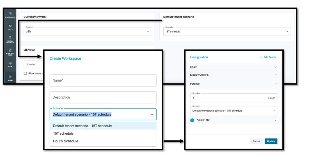
You can now access Emagin model results within Info360 Insight workspaces, giving you the ability to handle multiple model runs and forecast model scenarios, and providing users with the flexibility to analyze and compare different scenarios at the individual or default workspace level.
Cascading scenario effects
Administrators can now select a default scenario for their hub to make global changes in all workspaces. Workspaces can default to a tenant scenario (affecting all users in your instance) or be specific to a workspace. And for users who want to compare various scenarios, they have the ability to change their scenario on the fly to perform their own custom analyses.

This change provides flexibility for existing users, but it will also allow Emagin users (and other planned future Autodesk Water integrations) the ability to set default “base” workspace scenarios so that all components inside a chart can be conceptualized in the same scenario.
This ability to compare various scenarios and set a default forecasting condition provides users with a forecast view of their water and wastewater system which brings the predictive potentials of future Autodesk model integrations, further expanding the scope of data analysis and modeling capabilities.
Less clicks to create and manage forms
Within Info360 Insight, you can create forms to record measurements taken manually or to record observations you’ve made in the field, whether for field sampling or water quality testing. Once your data is entered, it will be available in your digital workspaces, your charts, and analytics for analysis.
To make it easier to use forms, you no longer need administrator-level permissions to design a form, nor do you need to configure new fake sensors to act as virtual data entry fields.
Users can now prefill their sensor configurations in their form design from bulk configured sensors, or create new virtual sensors on the fly by simply adding new input fields.
This ‘Create a new virtual sensor’ option when creating a form allows user-created line items in a given form. For the example we have below, a line item for ‘effluent color observed’ observation is added while inputting form information.
Being able to quickly create new virtual sensors with this new form workflow can simplify development of forms for various purposes; for example:
- Daily inspection forms
- Laboratory grab sampling input forms
- Visual inspection forms
- Permit limits
- Goal management
Analytic contextual help
We have added contexual help to Info360’s analytic builder to provide you with in-app assistance as you write analytic Expressions. The analytic builder now provides a detailed menu of Analytic Functions to help you choose the right function when building an Expression.
This means you can deploy calculations without having to use special characters in the output naming of a node. Simply select the function from the analytic contextual help drop-down list as you craft the analytic expression you’re working with, and your chosen function will be added to the Expression.
Having contextual help while you build your expressions should make analysis easier –and may help you discover related functions and how to better apply your domain knowledge to your data sets.
Stay organized with the Archive Manager
We have added an archive function that allows you to manage and organize large amounts of unused exports and reports. With the archive feature, you can maintain a level of version control for superseded entries and retrieve the information you need without having to sift through a cluttered list of old exports and reports. This feature is especially useful if you have accidentally created a duplicate report or want to hide old reports that you no longer need.
Historical chart expansion
As engineers and data analysts, it can be easy to spend many hours on data management activities. Data access, data cleansing, and trust in your data are fundamental to your ability to monitor and effectively operate your water and wastewater network and treatment plant assets.
To help you save time, for this release our team has put a great deal of development and engineering into expanding Info360’s data connection, handling, and visualisation components. Previously, you couldn’t chart data across very long time periods, and we think you will really enjoy how easy it is to quickly scroll through multiple years of data from as far back in the past as your data goes.
View multiple sets of data concurrently
To spot anomalies and validate your data, use Info360’s sampling engine to view multiple overlays of all the time sample intervals available. For a given sensor with the charting overlay, you can look at multiple resolutions – raw data, 15 and 30 minutes, hourly, daily, weekly, and monthly. This can be very helpful to visualize time gaps in data.
An on/off toggle switch for easy viewing
Sensors are not always available to you for every asset, for every metric you desire across your water, wastewater networks and treatment plants. We often are limited or must be creative within our constraints.
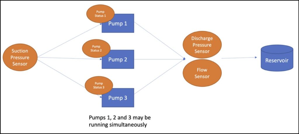
Below we’ve illustrated a pump scenario that is common to many utilities, one with limited sensors. This limited-sensor scenario can occur when you have multiple pumps within a pump station that is limited to a single sensor measuring flow and pressure downstream of your pumps.

Each pump can run independently, and they can run simultaneously. As you collect data over a period, it becomes increasingly difficult to distinguish what’s happening at each of your respective pumps. In this example scenario, you might want to know what’s happening at pump 1 versus pump 2 and 3. How is each pump performing against its design curves? How can you differentiate the one that is most active or most idle? If you want to answer these kinds of complex comparisons using only Excel spreadsheets – your computer might have locked up by now.
To help you with this, we’ve added a simple functionality: a toggle mechanism in pump performance charts. You can toggle within your chart to view data only when the pump is turned to status ‘ON’.
Your data is now filtered to view performance and usage against its pump curve independently. When you have tens or hundreds of pumps, this simple filter feature can give you some time in your day back and help you focus on the pump at hand.
Our first OLEDB Integration
To simplify your onboarding, we now offer support for GE Proficy (formerly known as iHistorian) using an OLEDB integration, which allows you to view raw data at any time and any resolution. The GE Proficy connection is our first OLEDB connection, so the groundwork has been laid to potentially add additional OLEDB connection types. Adding OLEDB to our library of connection types is a major enhancement for utilities to help them compare historical data over time to monitor and understand trends and detect leaks, bursts, equipment drift, and other anomalies.
Start using these new options today
Since this app is SaaS-based, there’s no need to update. You can start using the new functionality straight away. We encourage you to get fully acquainted with all of your new options and dig into our high-level roadmap to see our strategic vision.