Our next-generation, cloud-based Info360 Insight app has been developing rapidly, adding lots of new features and functionality in just the last few months alone. We’ve gathered up all of the release notes from this burst of development to show you some of the standout features that we’ve added and explain how they work.
If you haven’t already started using these features, we hope you’ll take this opportunity to dig into the details and start taking advantage of all of the great work from our product teams.
A library of pre-built templates
A key theme for our recent updates to Info360 Insight has been around templatization.
We introduced the basics of Analytic Template Libraries last year, with the aim of making data analyzation easier and more efficient for water and wastewater engineers. Since then, we’ve created a dedicated Analytics page, a central place for browsing, viewing, selecting, and saving analytic templates. Now, our customers have a library of pre-built templates to choose from.
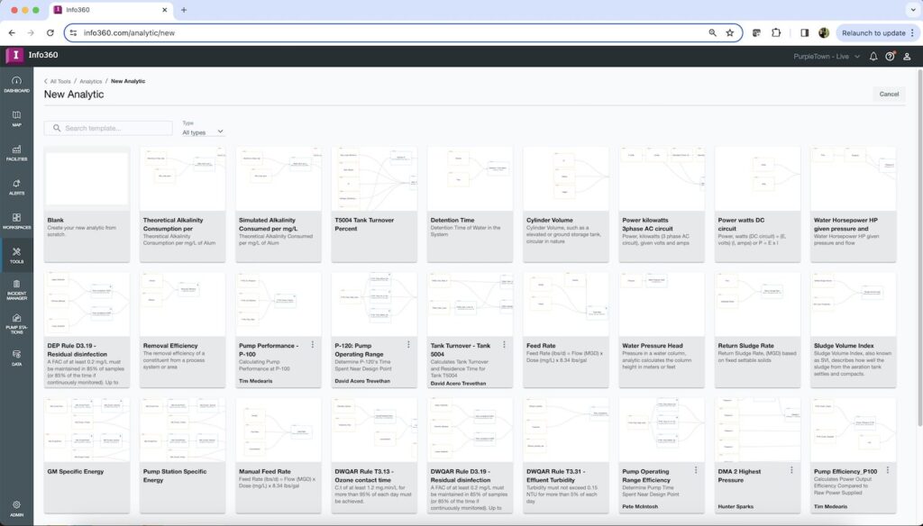
These templates were created by our team, and they cover a wide range of situations you might encounter when you want to crunch numbers to compute energy, water quality, or network/treatment plant hydraulics. Just plug in your data sources and start using them.
The list of templates is long, but here are a few examples:
- Pump-Specific Energy: Calculate energy transmitted by centrifugal pump to fluid handled
- Pump Efficiency: Calculate power output efficiency compared to raw power supplied
- Water Horsepower: Water horsepower HP given pressure and flow
- Carbon Equivalents for kwH of Energy: Report on the sustainability-related cost of your processes
- Detention Time: Calculate how long water is detained in the system
- Minimum Nightly Flow Leak Detection: Calculate MNF to identify incipient leakages
- Sludge Volume Index (SVI): Describes how well the sludge from the aeration tank settles and compacts
- Water Pressure Head: Pressure in a water column; calculates column height in meters or feet
- Cylinder Volume: Calculate the volume of an elevated or ground storage tank
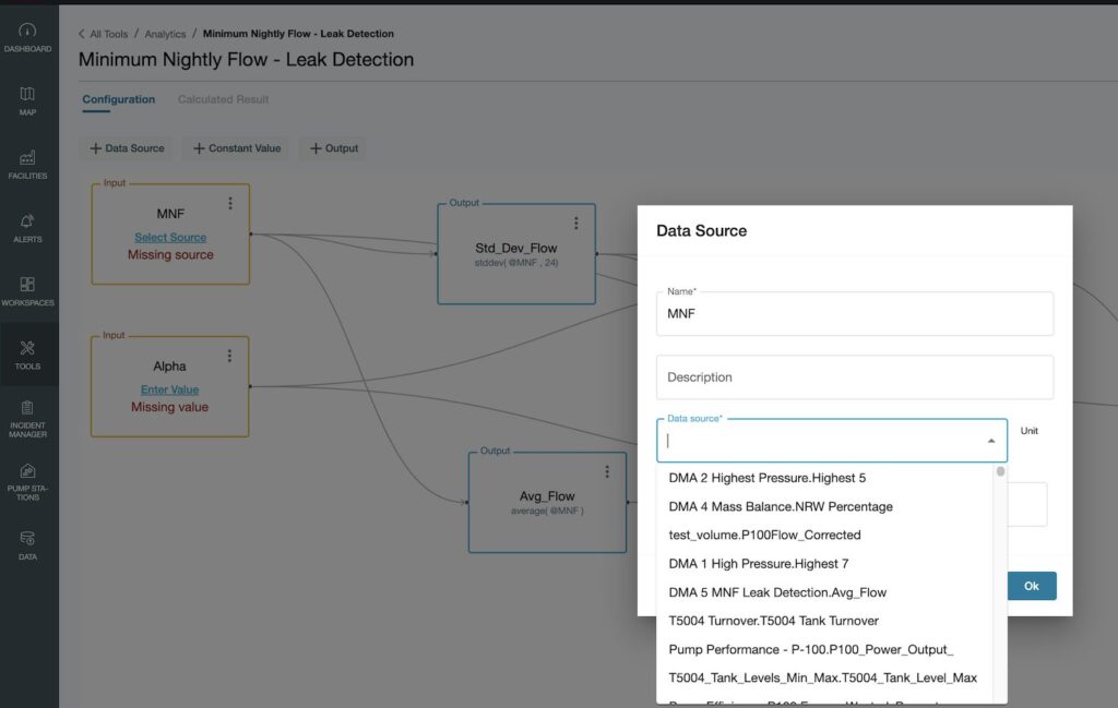
You’ll find many more pre-built templates using the search functionality. You can also filter by analysis type: sewer, storm, and drinking water or energy, water quality or water loss calculations.
We encourage you to modify these templates and share them with others in your organization. Don’t want to share them with everyone? You can control who can view and use them by setting permissions. You can also externally publish your work so that industry colleagues can access within their own Info360 Insight analytic libraries – and vice versa. Together, you’ll be able to avoid starting from scratch and find new ways to improve and perfect your analysis.
Workspaces can now be templatized
We’ve noticed that some consultants and engineers at water utilities spend a lot of time configuring Power BI dashboards. Many of them initially choose this tool because it may be bundled together handily with Excel and Word. But we also notice that many water professionals bump up against limitations once they’ve surmounted the app’s learning curve: a limited ability to work with large datasets, ongoing difficulties in understanding and writing DAX (Data Analysis Expressions), and an overly complex and outdated UI that doesn’t offer very compelling visualizations.
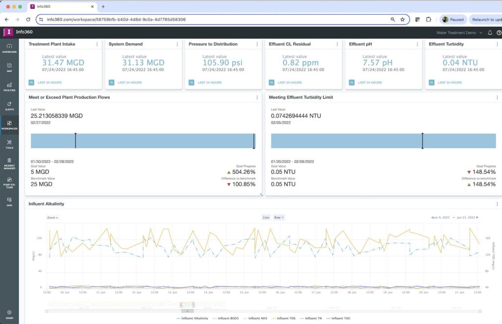
As we’ve been developing our next-generation Info360 apps, our product teams have given a lot of thought about how to make our cloud-based SaaS apps both outperform tools like this and be significantly easier to use. Right out of the gate, we had the benefit of creating these apps using modern UI and UX best practices, with the flexibility and ease of use that web-based apps can provide. And, of course, we’re creating something that is specifically tailored for use by water professionals, so we can focus on making dashboards that speak to their unique needs.
We think the dashboards we’ve created look very polished, and we want you to be able to take those highly configured dashboards and replicate them for others to use. Your art is your analysis. After you’ve created a beautiful workspace articulating network or treatment plant performance to hand over to your operations team, you shouldn’t have to do it all over again. For this reason, we’ve applied templatization to dashboards themselves.

Workspaces you’ve built, along with all of their attributed configurations, can now be saved as a template. In fact, all workspace components and “dashlets” can now be saved. Chart names, descriptions, and chart settings such as colors and line-types are now ready to be used again. All you need to do is map them to new data sources.
For improved shareability, we’ve also added shortcuts. You can add a Quick Access Link to the analytics, forms, and other components that you use all the time and make them more easily accessible.
Sensor performance: monitoring the monitors
Info360 Insight now provides a sensor health status, which allows you to check if a sensor is receiving data as expected. The health of a sensor is categorized based on its uptime:
- Good = > 94.9% Uptime
- Fair = Uptime between 84.9% and 94.9%
- Poor = < 84.9 % Uptime
While reviewing sensor quality, you can also view a sensor’s health trend for the past seven days and visualize all data streams directly within the sensor configuration page, without having to create a separate chart or dashboard. It also allows you to quickly locate a sensor on a map. Prior to this improvement, you would have had to manually open a dashboard and create a chart to visualize data streams. There was no easy way to assess whether a sensor required attention.
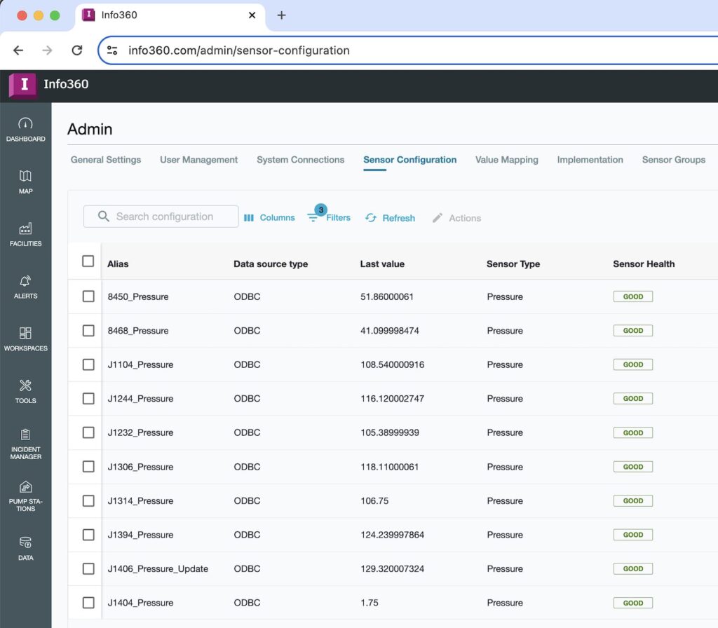
With this new capability, you can quickly detect if a sensor needs recalibration or if an incident needs to be reported. If further attention is required, quickly locate the sensor and schedule an equipment check if necessary. We believe this new feature will lead to improved knowledge of how sensor performance impacts the quality of your data and decisions, and ultimately, better ways of working with the data you collect.
Info360 Insight also has a new Notification hub where you can view information about calculations, processes, and connection status. For example, if communication between Info360 Insight and your database or historian is lost, you will receive a notification alerting you to the disruption. You’ll also see notifications when any calculations or processes you run (eg, analytics) are completed.
Know your latest sensor values with heatmaps
Info360 Insight now offers the ability to display heatmaps on your map for easier monitoring and visualization of your latest sensor values. You can enable this by toggling the “Show as Heatmap” option when configuring a map theme and even set up customized colors and ranges for your sensors.
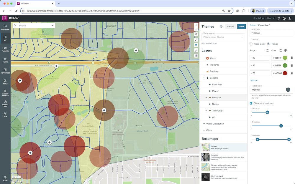
You can also now use our new tag types to add the latest sensor values and text annotations to your interactive images.
Thanks for the ideas and feedback
In developing these apps, we’ve had the benefit of an excited group of early adopters who have provided feedback to help us build exactly what they need. Their input has helped us speed up our development, and we want to say thank you for all of your excellent input! We also want to say, “Keep the ideas coming.” If you’re an Info360 app user, let us know what you want to see on our Autodesk Water Feedback Portal and stay up to date on what we’re building by consulting our public Autodesk Water Solutions Roadmap.