Step-by-step:
After a steady state simulation has been run successfully, you can use the Report Manager to view different reports from your simulation in both tabular and graph formats.
- To begin, double-click the desired project .aprx file to open ArcGIS Pro.
- On the ribbon, InfoWater Pro tab, Project panel, click Initialize.
- On the InfoWater Pro ribbon, in the View panel, click Report Manager.

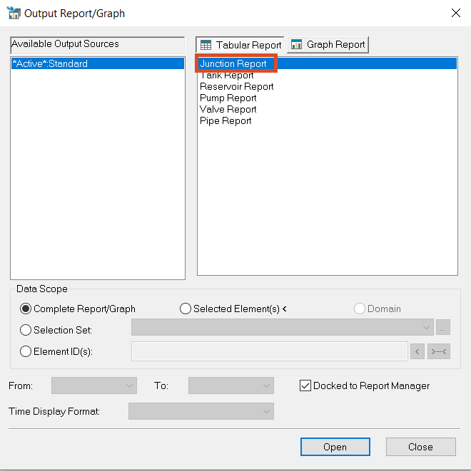
- In the Report Manager dialog box, click New.
- In the Output Report/Graph dialog box, select Junction Report.
- Click Open.
A table appears that contains one record for each junction node in the current InfoWater Pro project. To sort the results:
- Click the Pressure heading to select the column.
- To sort the column, from the toolbar, click Sort Ascending; the highest pressure in the system is 169.94 psi.
- Click Sort Descending; the lowest pressure in the system is 1.75 psi.

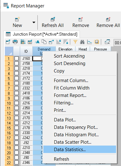
To access the data submenus:
- Click the Demand heading to select the column.
- Right-click the heading and select Data Statistics.
These numbers show you information such as the highest demand (Maximum Value) and the total demand in the system.
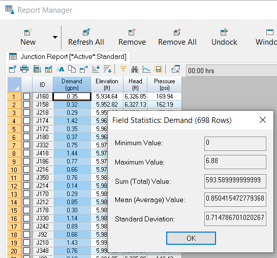
- Click OK to close the Field Statistics window.
To view reports or graphs based on a selection within the model:
- On the InfoWater Pro ribbon, Domain panel, click Enlarge Domain.

- Select an area of the system of between 50 and 100 pipes.
- (Click and drag the Report Manager to the side.)

- In the Report Manager, click New.
- In the Output Report/Graph dialog box, select Pipe Report.
- Under Data Scope, select Domain to limit the report or graph to the active domain.

- Click Open.
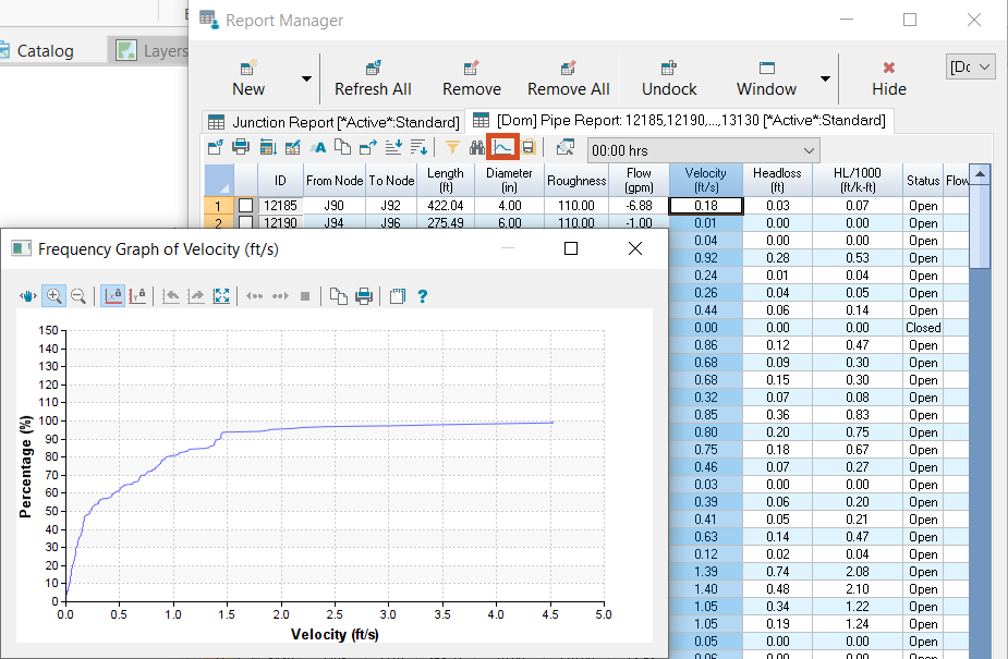
The Report Manager populates with a table that contains only the data for the pipes you just selected. To see their velocity data:
- Select the Velocity column heading.
- From the toolbar, click Frequency Graph.
- When you are finished reviewing the data, close the graph and the Report Manager.
- On the InfoWater Pro ribbon, Domain panel, click Clear Domain to undo the pipe selection.