00:04
To help view extended period simulation results,
00:07
you can create an animation of a color coded map.
00:12
you can configure the map display options to create an animated map
00:15
of pressure for junctions and velocity for the pipes in a network
00:20
to begin. Double click the desired project dot AP Rx file to open
00:26
Once the project starts,
00:28
click the info water pro tab to open the info water pro ribbon
00:32
in the project panel, click initialize
00:37
on the info water pro ribbon
00:38
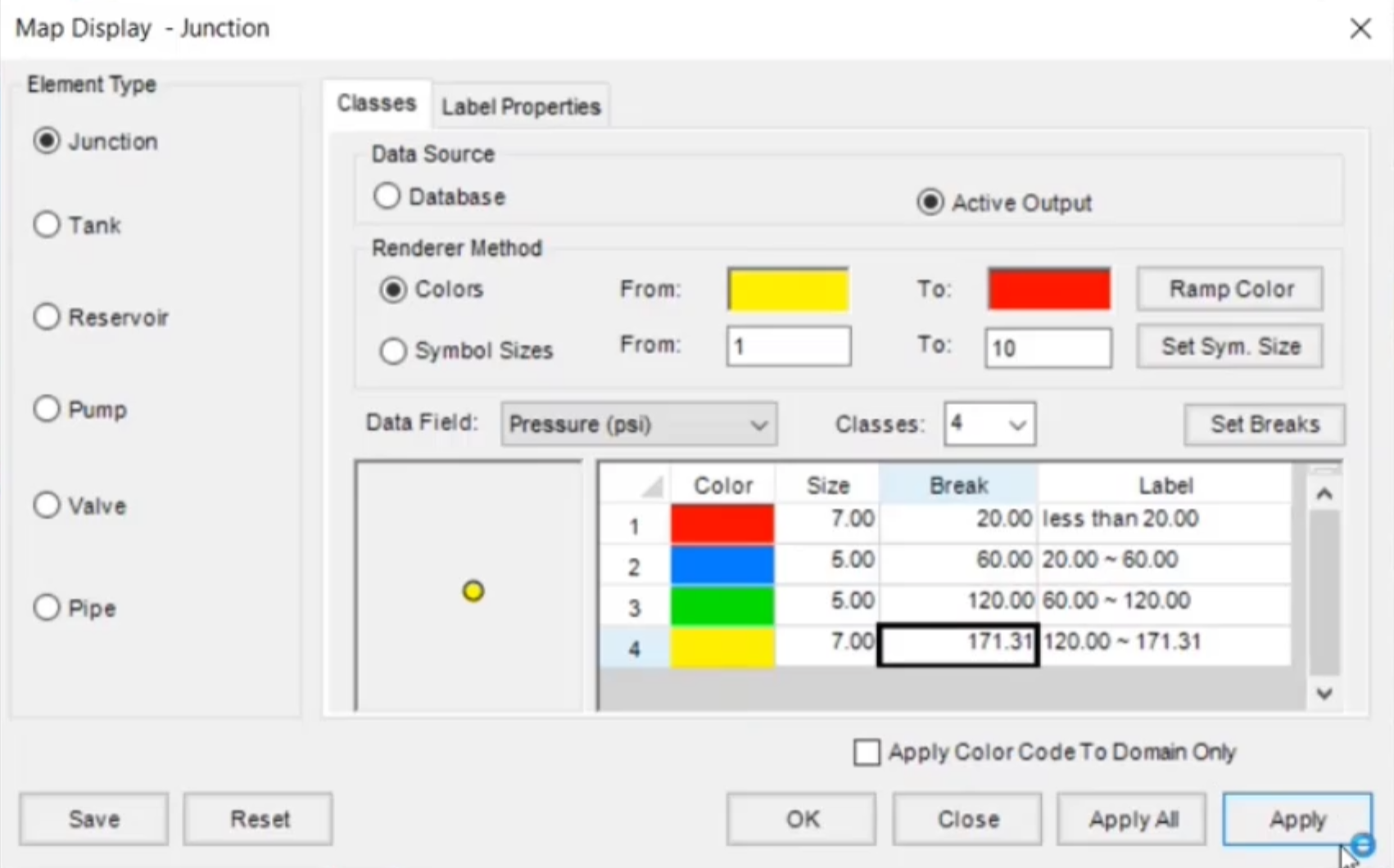
in the view panel, click map display
00:42
in the map display dialog box,
00:44
select junction as the element type and active output as the data source
00:51
in the data field. Dropdown list select pressure
00:54
set classes to four and then click set breaks
00:59
in the table change the settings in the four rows two
01:10
color blue size five, break, 60
01:15
row three color green size five, break 120
01:24
size seven brake 171.31
01:34
Now select pipe as the element type
01:36
and make sure that active output is selected as the data source
01:41
in the data field, drop down list select velocity
01:45
set classes to three and then click set breaks
01:50
in the table, change the settings in the three rows too
01:55
color yellow size two brake, 0.5
02:12
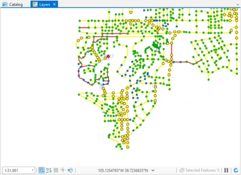
click apply and close the map display dialog box
02:18
zoom to the extents of the model and view the map to see
02:21
the pressure and velocity displayed by the color coded ranges that you just set
02:27
in the model explorer
02:29
scroll the output time bar to a different time and see
02:33
that the color coding updates to reflect the current output value.
02:38
Be aware that in larger models dragging the time bar may cause the map
02:42
to freeze as it loads in the new data corresponding to the time step.
02:47
You can disable refresh output to prevent this.
02:50
But then you would need to re enable it to update the map at your desired time step.
02:55
You can set up an animation of this color coded map,
02:59
drag the time bar back to zero hours
03:04
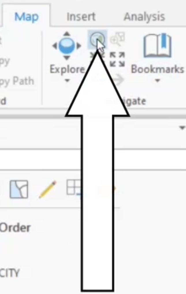
in the navigate panel,
03:05
click the full extent icon to see the full extent of the model in the display
03:10
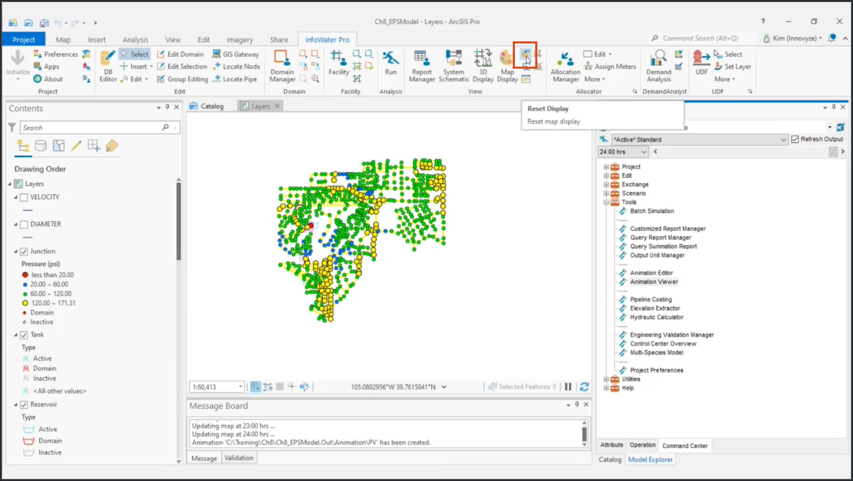
in the model explorer on the command center tab,
03:13
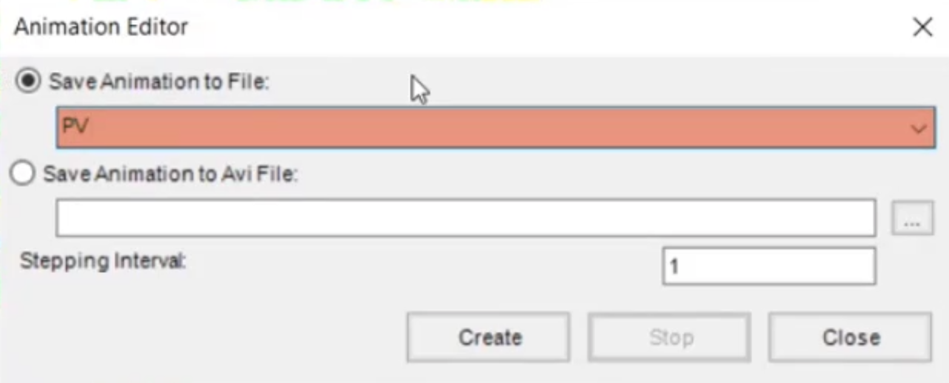
expand the tools folder and double click animation editor
03:18
in the animation editor, dialogue,
03:20
select save animation to file and then enter a name of PV for pressure, velocity,
03:30
a progress bar appears as a screenshot is taken
03:32
of the thematic map at each output timestep.
03:36
This takes a few minutes to complete
03:39
once it is completed double click animation viewer in the tools folder.
03:45
If you did not zoom to the extent of the model,
03:47
your animation only includes the features that were in the viewable map area.
03:51
When the animation was created
03:54
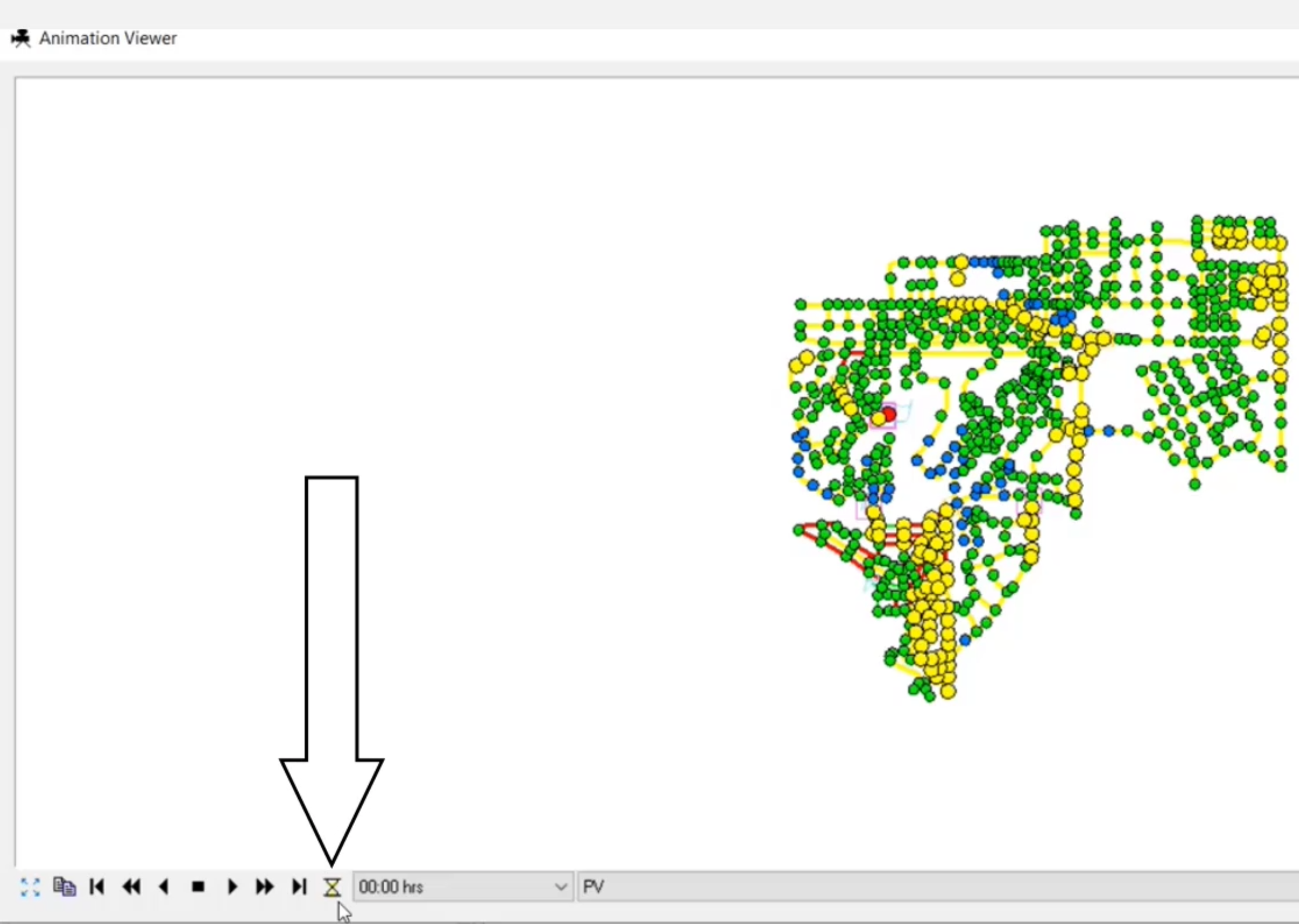
in the animation viewer, click the delay setting, hourglass icon,
03:59
set the delay time to 250 milliseconds and then click, OK,
04:04
click the fast forward icon to animate the graph
04:08
for optimal results.
04:10
The viewers should be the same size and dimensions as the map area.
04:13
When the animation was created.
04:18
map display provides a dynamic and powerful way of
04:21
categorizing your project visually based on defined criteria.
04:25
It can also be used for other data elements such as pumps, valves,
04:30
tanks and reservoirs.
04:33
Close the animation viewer
04:35
on the info water pro ribbon
04:38
click reset map display to reset the display to
04:41
the default display as set in the preference.