& Construction

Integrated BIM tools, including Revit, AutoCAD, and Civil 3D
& Manufacturing

Professional CAD/CAM tools built on Inventor and AutoCAD
5 min read
Since this past summer, you have been trying the UI preview and giving us lots of feedback. We distilled them all down to these major concerns:
We were inundated with proposals of how we should improve the toolbar layout. Everything from napkin sketches to full design mockups. This is exactly what we wanted, and based on what you told us, we got cracking on addressing these key concerns and updated the UI so that it is leaner, less distracting, and more productive. Check out the post below, or watch this quick video (you get to see my ugly mug too).
In the January 9 update, we made updates to the UI Preview to address some of these concern:
With these improvements out in the wild, we’re excited to share with you what else we’ve got brewing to address your other concerns (drum roll please)!
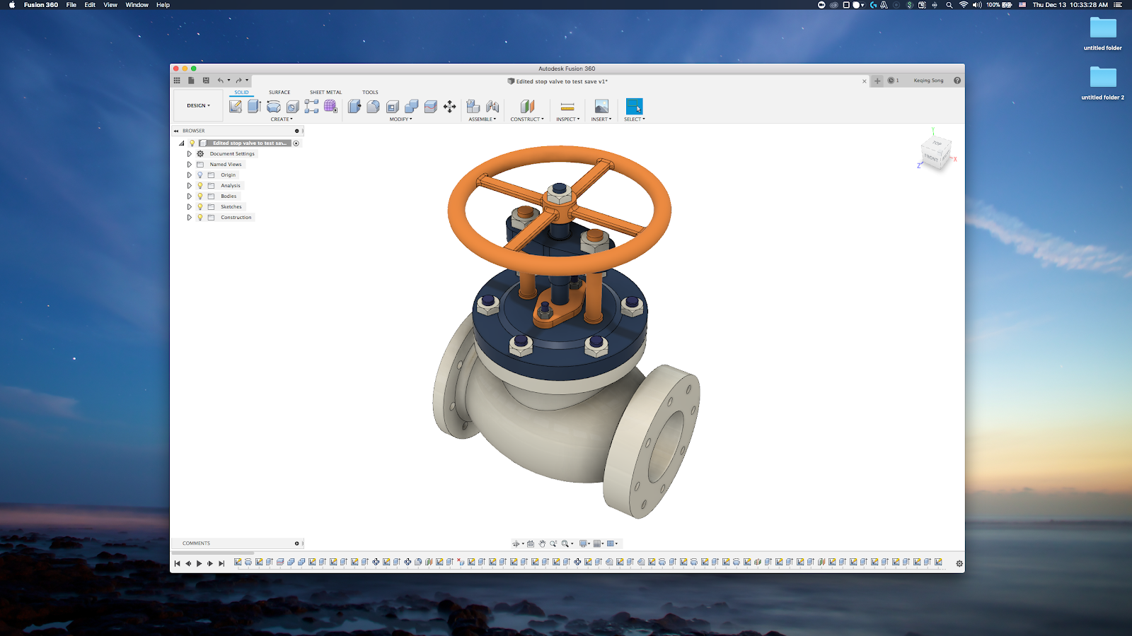
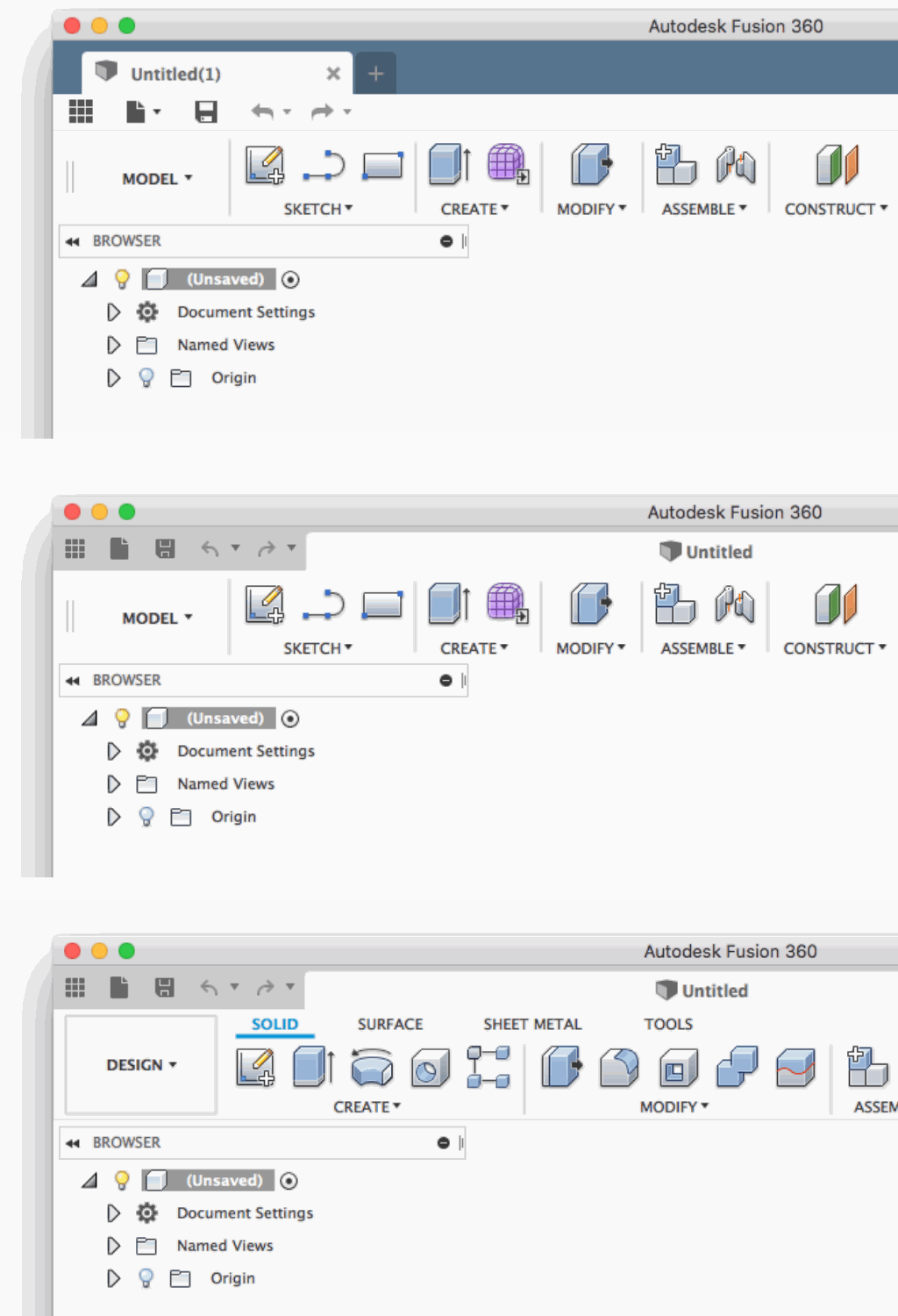
At first glance, it’s nothing drastic. Once you start really looking it at, things become much more apparent. I’ve been testing this new iteration with the team for a while now, and after using it, I didn’t want to go back. I hope this is how you will feel as well :). Let me walk you through the key differences and benefits.
*Note – all screenshots shown below are with UI Preview turned on. You can learn more about UI Preview here.
Less distractions
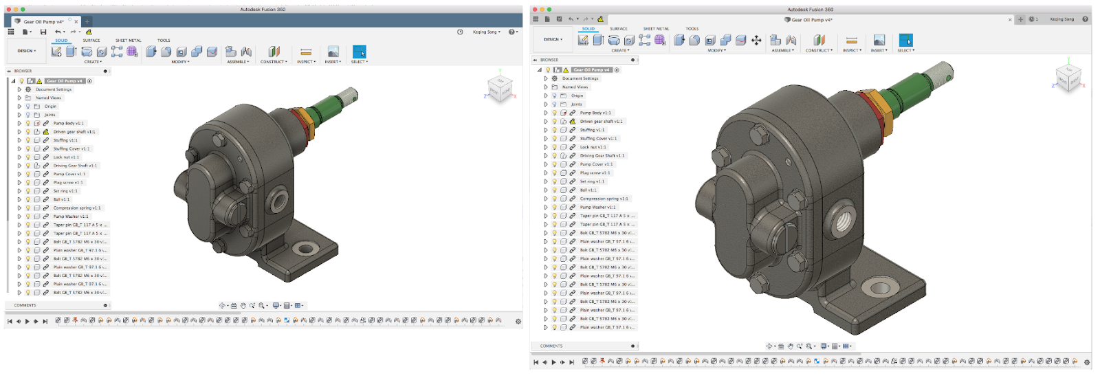
Let’s start the most obvious change – color. We’ve heard from you that the blue bar at the top can be distracting, and making Fusion 360 look top heavy. We agree that the focus should be on your designs, so we’ve made the toolbar look more neutral, so you can focus on what’s really important.
Less clutter
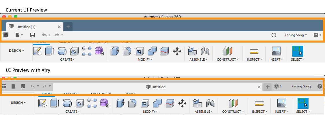
The next change to notice is how we’ve positioned the document tab inline with the quick access icons (QAT). This allows us to make the most out of the available real-estate, and at the same time, giving design real-estate back to your designs. File menu, profile, and help menu icons no longer have down arrows to reduce horizontal space and visual clutter.
Full document names displayed

Doing so also enables Document tabs to take full width with name of the document in the center, finally showing the full document name (if you have long document names). They will evenly divide themselves as you have more documents open.
Better document tab feedback

Previously when you hovered over a tab, you’d get a tooltip only if the document name was condensed. This was confusing. Now when you hover over a tab, you’ll see a tooltip with the Design Name and the Project it lives in, regardless of whether or not the tab is showing the full name or condensed name.
More predictable document tab overflow experience
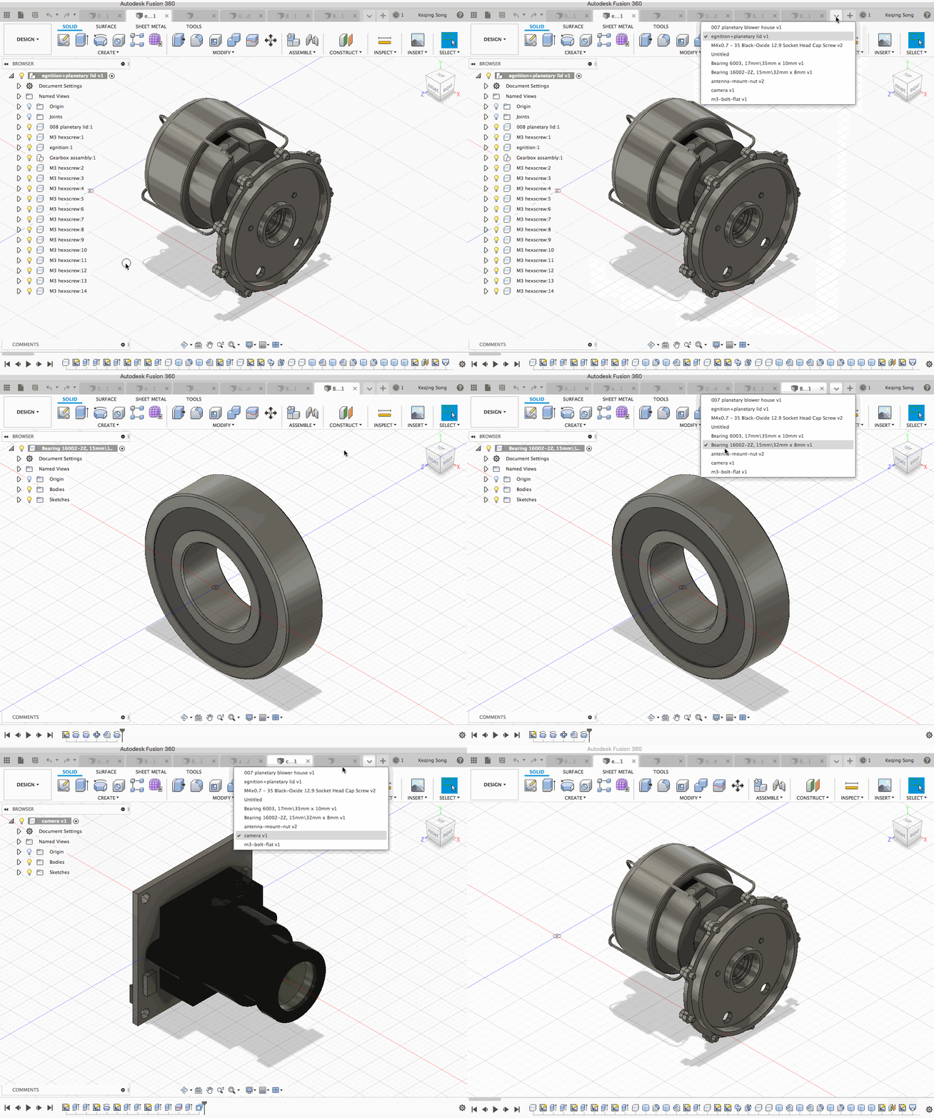
Previously when you had many documents open and wanted to navigate through them, you had to click these wonky back-and-forth buttons and find the document you want to activate. We’ve updated this experience with a simple drop-down menu, where you can pick the exact document to go to, and get there with confidence.
Familiar status icons for Save and Read Only

We’ve re-evaluated how Fusion 360 shows intermittent status messages. Some of those messages have been repurposed into familiar icons that appear next to you document name. When you save a design, you’ll see a check mark when the design is saved, and “Read Only” designs (such as sample files) will show a lock icon next to the name, indicating that it is a read-only format. Other messages will appear in areas of the UI where it makes the most sense.
More design canvas space

As a result of combining the QAT bar and document tab bar, the new app bar gives back 8% more design canvas space (with UI Preview turned on). Woohoo!
We’re targeting to wrap up Project Airy and have it ready some time Spring of this year
This will affect the production UI as well as UI Preview.
Today, the UI Preview is turned off by default, and is something that is available for all of you to try. Our goal is to mature the UI Preview and make it the official UI experience of Fusion 360 moving forward. Before that can happen, there are still a few important steps for us to take.
New API support for 3rd party add-ins
In the Jan. 9th update, we provided a mapping for panel IDs so that existing add-ins can run in the UI Preview. We’re working on new API for you to use so that you can update your add-ins to work appropriately work with the UI Preview. We’ll keep you posted on when the new API will become available.
Fit and Finish
We’re anticipating that we find nooks and crannies within Fusion 360 that may require additional refinement before the UI preview becomes the default UI. We’re doing our due diligence to cover all the bases, and have a number of fit and finish tasks on deck.
As always, we appreciate your continued support and would love to hear about your thoughts.
By clicking subscribe, I agree to receive the Fusion newsletter and acknowledge the Autodesk Privacy Statement.
Success!
May we collect and use your data?
Learn more about the Third Party Services we use and our Privacy Statement.May we collect and use your data to tailor your experience?
Explore the benefits of a customized experience by managing your privacy settings for this site or visit our Privacy Statement to learn more about your options.