If you’re part of the Fusion 360 community, you’re probably well aware that the software is constantly evolving. Many updates have included brand new functionality that opened doors to more workflows, but not a whole lot has been made to the user interface (UI). This is about to change.
Better UI+UX means better Fusion 360

The Fusion 360 UI through the years, from 2013 to present.
We’ve improved the UI and user experience (UX) over the years based on how you use the software, what you struggled with, and what you enjoyed using. As Fusion 360 continues to mature, we need ensure that the UI is also able to adapt, scale, and not get in the way of new workflows. It also needs to be more stable, more reliable, and resilient against wonky behaviors. Even if we developed the most awesome feature ever, a clunky and outdated UI hampers the whole experience.
We’ve also heard feedback from those of you who are new and learning Fusion 360 for the first time, how confusing it was to go in and out of different environments. The transition between Sketch mode and Modeling modes, for example, were very subtle, and the software wasn’t very good at letting you know where you are. Sketch, in particular, didn’t have a lot of toolbar real-estate, which means you’d have to find other ways to bring up your tools quickly. With the notorious toolbar disappearing issue we’ve seen reported on the forums as well as a slew of other wonky behaviors, the UI hasn’t been the most stable thing either.
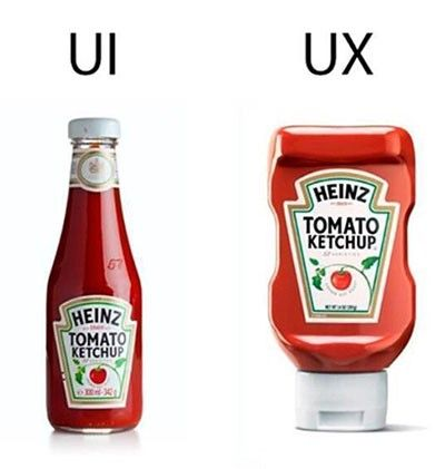
One looks great and familiar, but the other works a whole lot better. We’re improving both UI and user experience (UX), so you get best of both worlds.
There’s a saying that goes like this: “A user interface is like a joke. If you have to explain it, it’s not that good”. As important features in modeling, sketching, 2D Drawings, etc. are getting the attention they deserve, the software’s UI is also in dire need of some love. You’re using one of the most advanced CAD softwares on the planet. It should look and feel like it.
Fusion 360’s fresh new look
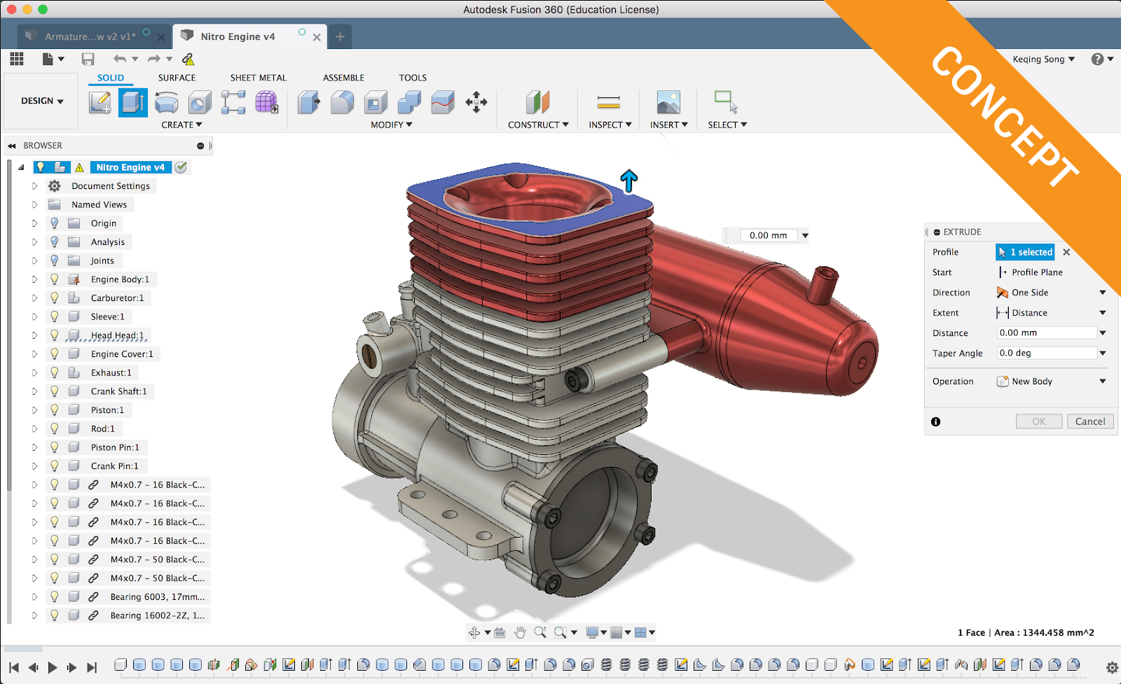
Here it is, your first look at the new UI concept, currently work in progress.
Our overall goal for this change is improving usability and performance of the UI framework. To reach this goal, we focused on 3 key areas of the UI:
- Modern visual treatment
- Better spatial awareness around Fusion 360’s various environments
- Boost productivity
“Simplify, and add lightness”
Even though this quote was coined by Colin Chapman in the world of motorsports, it applies in the world of software UI as well. Aside from a modern color palette, we also aimed to reduce visual clutter, improve spacing between text and icons, and make the whole experience feel more cohesive.

The toolbar now looks like one entity, whereas previously it looked like different puzzle pieces stuck together. The new colors make it look more lightweight and “airy”. There are still some fit and finish tweaks we are going to address in the near future, as well as an icon refresh to go with our UI. Since the toolbar will no longer be in a floating state like it is today, we were able to improve its performance and squash a number of wonky issues that caused the UI to behave abnormally. Some of these issues we’re addressing include:
- Toolbar disappearing when dragging the Fusion 360 window
- Wonky UI behaviors that cause Fusion 360 to crash
- Toolbar appearing in front of other windows and grabbing attention
- Toolbar not being captured when taking screenshots with SHIFT+COMMAND+4 and SPACE key on Macs
Know what mode you’re in, always
We’ve all been confused on about all the different modes you can get yourself into when you’re trying to learn Fusion 360 for the first time.
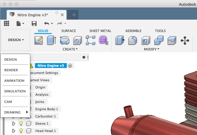
Based on feedback and popular usage patterns we’ve seen, we’ve overhauled the way commands are organized. The workspace switcher now includes a set of workspaces that play a distinctive role in the product development process, and all the tools you need to design a 3D model is now within the Design workspace.

The Design workspace has a number of different tabs, which contain their own set of tools.
- The Solid tab contains tools typically used for solid modeling. This is just like the old “modeling” workspace toolbar.
- The Surface tab used to be the “Patch” workspace, and contains your familiar surface tools.
- Sheet Metal is now also a tab, and contains sheet metal specific tools like flange and rules.
- Assemble tab is where all your joint tools live, as well as other assembly specific tools.
- Finally, the Tools tab contains 3D Print, Scripts and Add-ins, as well as Manage Materials and Compute All.
Keep in mind that some of the more popular tools, like Create New Component and Create Sketch, can be found in multiple tabs, because they play a major role in many Fusion 360 workflows.
We’re working on releasing this experience as a tech preview soon, so keep an eye out in upcoming updates and the next What’s New posts!
Your favorite tools, at your fingertips
Here are a number of areas we’re improving so that you can access your most frequently used commands faster.
Contextual tabs will give you more space
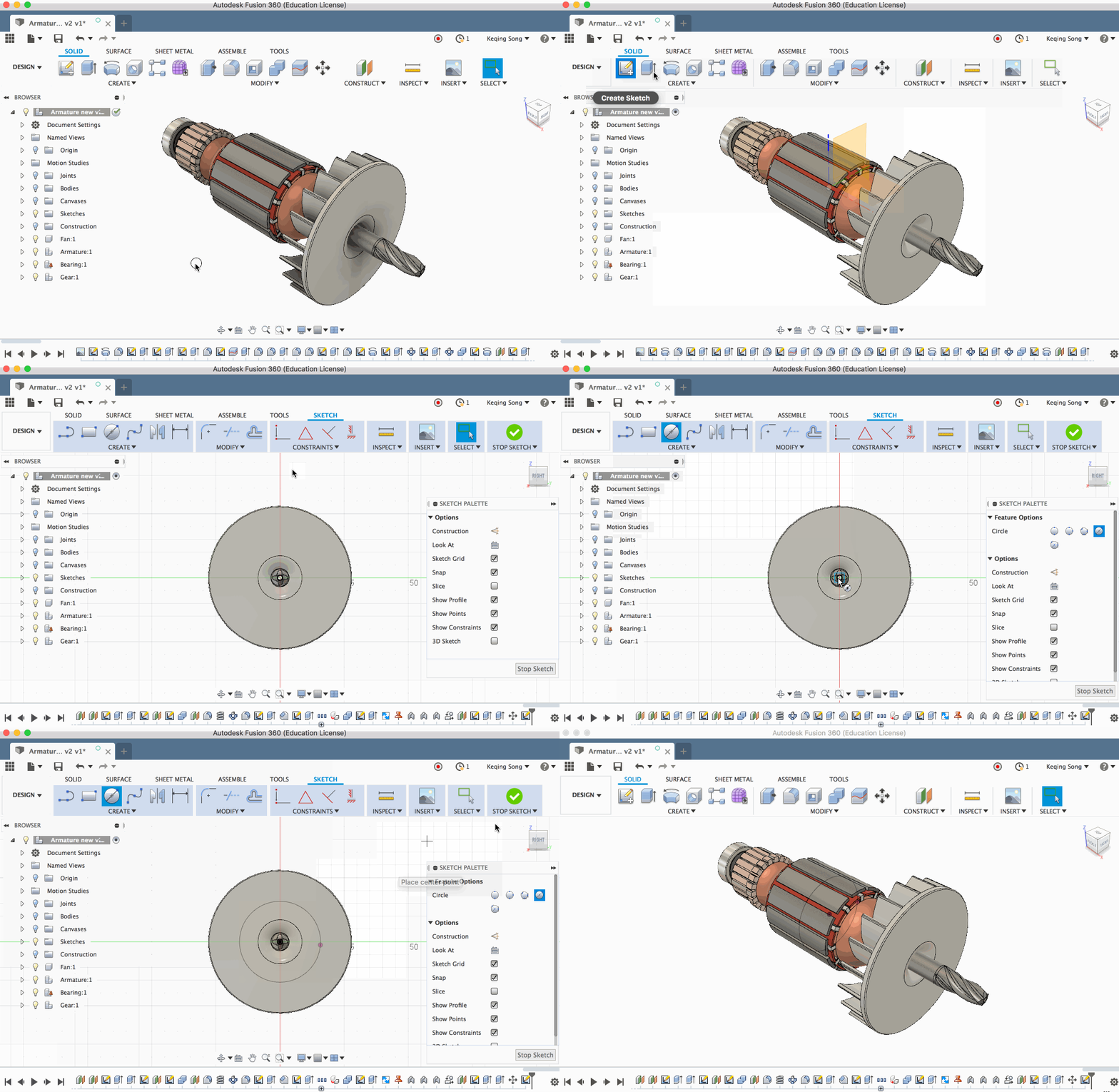
Hit Create Sketch and behold, a new Sketch tab appears, with a toolbar now dedicated for sketch commands. Sketch constraints will also be up there, so that you can easily access them without needing to go to the sketch palette. The Sketch palette is still there for contextual options while you’re sketching. Once you’re done sketching, click the green check icon to get back to your previous tab.
Panel drop-down options
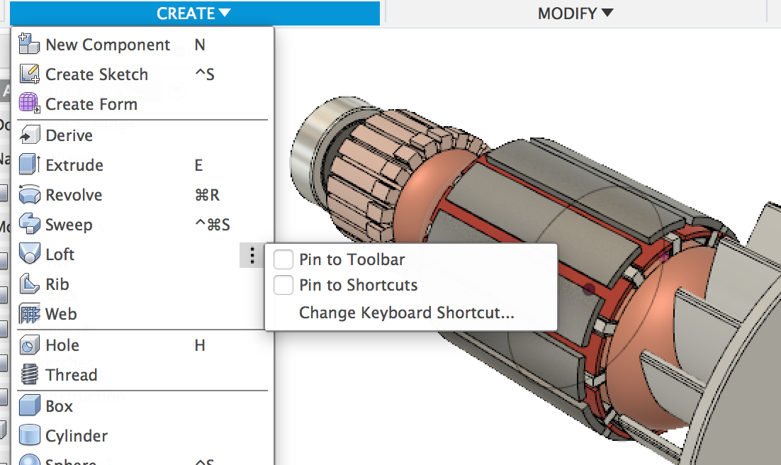
Now when you hover over commands in the panel drop-down menus, you can click on the more options icon and pin the command to the toolbar, pin the command to your S key shortcuts (currently known as S key toolbox), or assign a custom keyboard shortcut .
Custom Keyboard Shortcuts
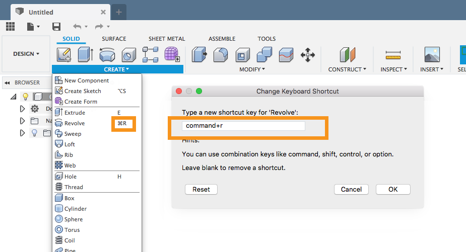
Yeah, you read correctly. The long awaited project is finally coming into fruition. We socialized our initial thinking with you on the forum a while back, and got some good feedback. We went down a slightly different route than what we had first imagined, but we think this experience is nicer and more lightweight.
Within that same more options menu, you’ll be able to assign a custom key (or modifiers + key) to a command. The keyboard shortcuts you assign are saved to your preferences, and go wherever you go. You can finally show off how pro you are by signing into a different machine with Fusion 360 and launch commands like a boss. Check out this forum post for more details.
Right-click menu

Accessing your (S) key shortcuts has expanded into the right-click menu, allowing you to quickly access them with a simple right-click. If the list of shortcuts grows larger than 10, the menu will collapse into its own category, so that it doesn’t clutter up the main right-click menu.
This is just Phase 1
In the summer updates, you’ll began to a number of these improvements appear. It won’t be all at once; it’ll happen phases. We’re excited to get this out to you all, and are planning to continue to improve on upon this UI. The next phases will only get better, and will include things like:
- More shortcut keys for file options and display setting
- Better browser performance
- Better open/import path
- Better icon and UI scaling for high-res displays
- Dark Theme
Some of the things mentioned above will land earlier than others, and some may take longer to complete due to other functionality dependencies. Regardless of what we do, we’ll be sure to keep you posted on our progress!
We have ideas on how we want to build out certain features, but we’re also open to hear your thoughts and feedback. Feel free to comment in the comment section below, and let’s chat.
Cheers!
