Hey folks, thanks for checking out the latest What’s New blog! For this update, Aaron (from the What’s New videos & QUICK TIPS) will give the rundown on what you’ll find the next time you restart Fusion 360. There’s some good stuff, so buckle up…and LET’S DO THIS!
2.0.3173
Sketching
Improved! Sketch Transparency
If you’re like me, you were thrilled when we changed Fusion 360 to make sketches semi-transparent when not active. This is incredibly helpful when inside a sketch, BUT, when outside of a sketch, it can make them difficult to see. This effect is compounded when outside of a sketch, and active on another component. This situation effectively double-downs on the transparent effect. Doh!
In this update, we’ve made it so that …
- When inside a sketch, inactive sketches will become semi-transparent (as they do today)
- When not inside an active sketch, no transparency should be applied to sketches (besides the regular active component behaviors).
Clear as mud? Well, use this handy image to compare and contrast the current behavior against the new behavior:
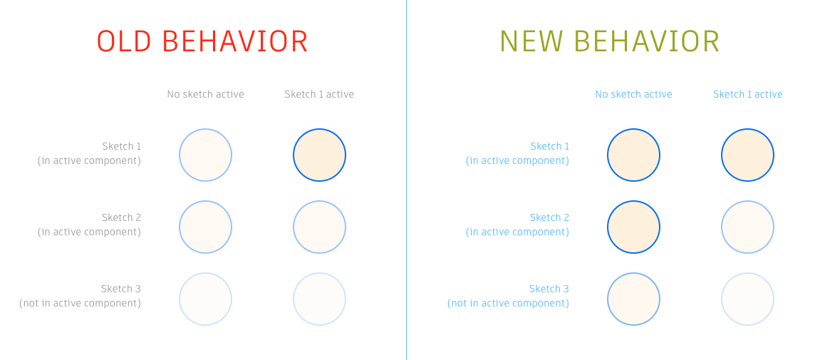
I hope you like this tweak as much as I do! My old eyes could barely see those double transparent sketches.
New! Copy and Paste a Sketch between designs
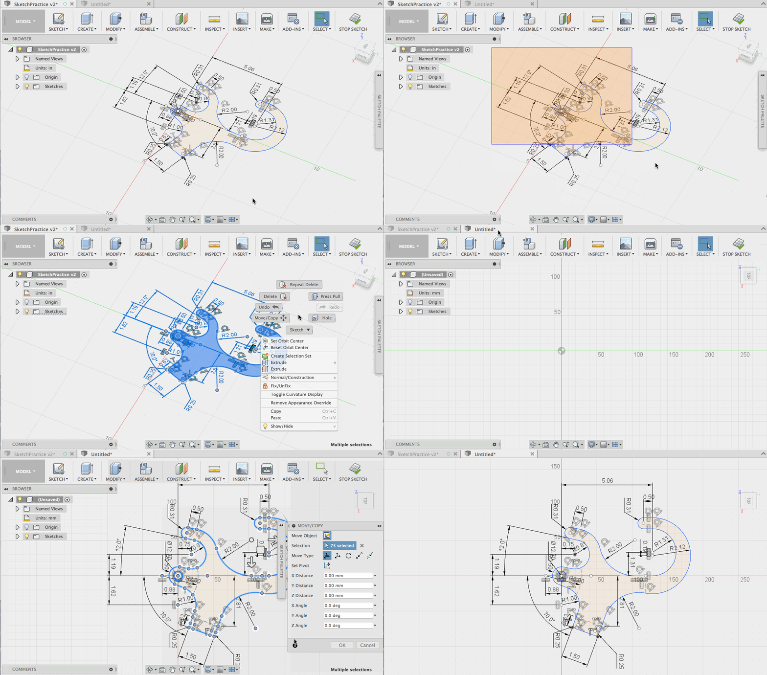
If you’re… um efficient (sometimes lazy) like me, you get . For example, when I create a fully constrained & dimensioned sketch in one design, the last thing I wan to do is recreate it in a different design. Well, now we don’t have to do that. Sketches can be copied and pasted from one design to another.
New! Maintain Sketch Visibility on Feature Creation
One of the powerful things within Fusion 360’s sketching environment is the ease in which to create and use multiple contours at one time. These contours selections are so robust that even when a sketch is edited later and contours added or split, subsequent features often rebuild without issue. Not only does this encourage you to add multiple contours to those sketches, but it also encourages you create multiple features from a single sketch.
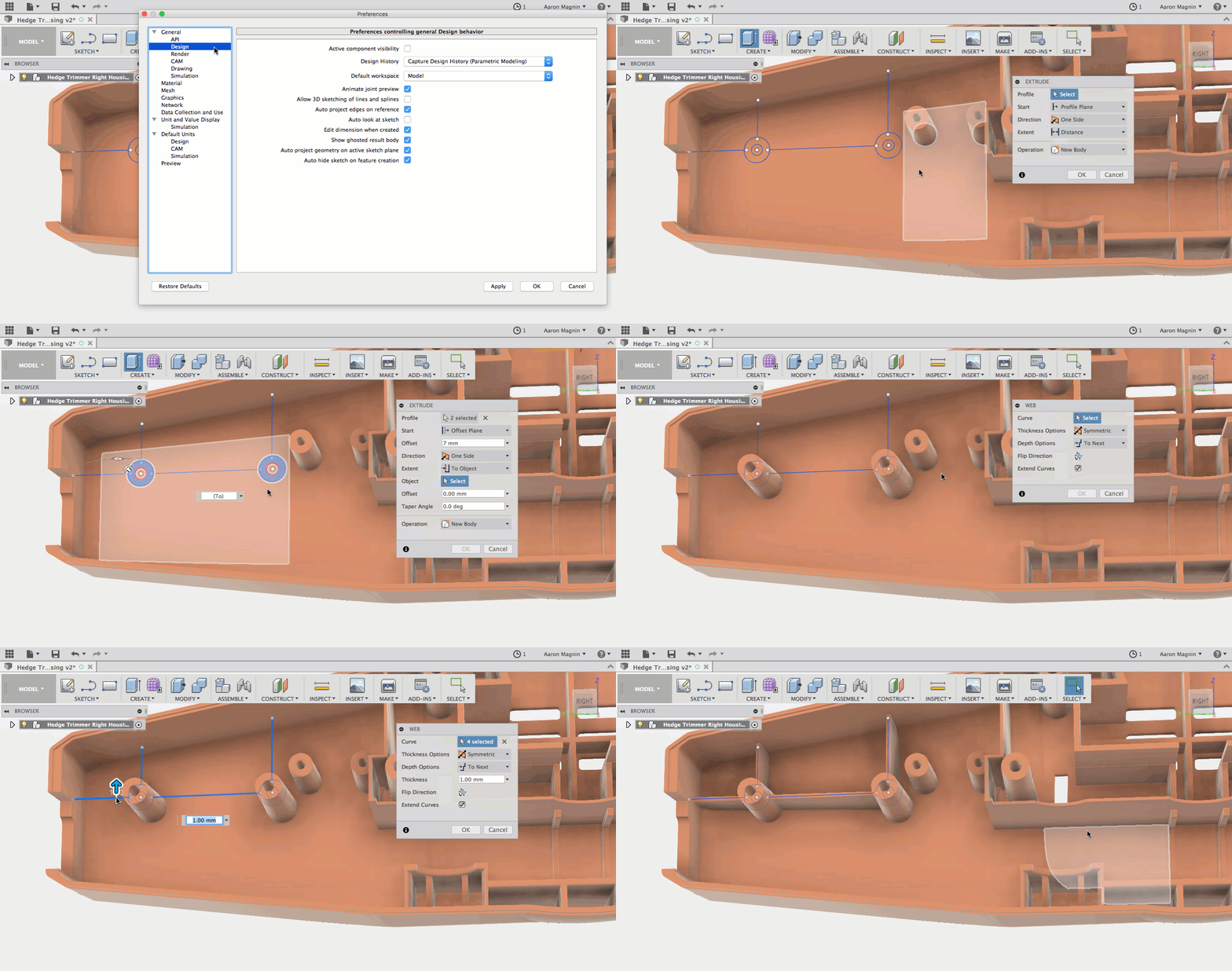
The problem was that when the first feature was created from a sketch, the default behavior was to hide it. This does help declutter the interface, but would add an additional step whenever I wanted to reuse those sketches for 2nd, 3rd, and even 4th features. Going forward, you’ll find a preference to control this behavior in the design section, which is ON by default:

Watch in the gif below as I turn this preference off, then use a single sketch to create multiple features without having to find and show that sketch as an added step:
Modeling
Improved! Interrupt Expanded
Users have been vocal in praising the new ability to interrupt those endless “Compute All” operations. In fact, it was so popular, we’ve decided to expand this ability to other features and commands. To that end, we’ve added this interrupt-ability to situations that include…
- Feature deletion
- Feature suppression
- Reordering of features
- Converting features to direct modeling features
- Computing after editing a sketch
- And finally, computing after breaking a XRef link

Notable Fixes:
- MAS Install & Scripts and Add-Ins
For those of you who installed Fusion 360 from the Mac App Store, you may have noticed that Scripts and Add-Ins were nowhere to be found when you went to use them. That’s what we realized when @dbors reported this in the forum (thank you!). We’re happy to report that this has now been fixed.
- Scripts and Add-In Default Path
Somewhat related is a new ability to define where those Scripts and Add-Ins are installed. Just open up those preferences, and you’ll find it in the API section:

Rendering & Graphics
New! Disable Surface Normal Display
Speaking of new options, we have another notable one that will be found in the ‘graphics’ section. Those of you working in the patch workspace will appreciate the ability to control whether or not a ‘normal’ side coloration will be visible. Not certain of what I’m referring to? Check out the image below, where I’ve kept the traditional coloring on the left, and what it will look like with the new option enabled on the right:

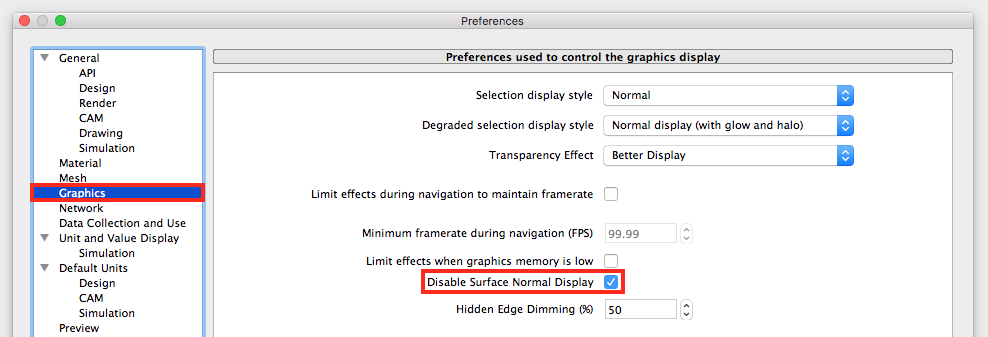
By default, Fusion 360 colors one side of a patch with the applied appearance, and the “normal” side another color (yellowish). This is done to help identify which is which, but some users don’t need this, nor do they want the performance draw related to it. With the new option, you can disable this behavior and keep chugging away with the appearances you’ve applied!
To change this option, open up those preferences. In the graphics subsection, you’ll find it:
Notable fixes:
- Exposure Setting Reset in Fusion Team
We’ve now synchronized exposure setting from the rendering environment to Fusion Team. Previously, user-defined scene exposure would reset to the default, a pretty annoying experience! Now the override won’t happen anymore, but it’s also worthy to note that appearance in Fusion 360 and Fusion Team are not apples-to-apples, so it might take some additional adjustments.
- Save as……(blank)
Rendering on the cloud is a nice time saver, but sometimes – like when you’re away from an internet connection – rendering locally can really bail you out. Unfortunately, when users would go to save these images out while in offline mode, the “save as type” drag down table was blank! This left users confused, and when it would save files without an extension (eg .png or .jpg), their operating system equally confused. Well, this won’t be the case anymore, because we’ve added common presets to choose from! Woot!
- Consistent Rendering Revisited
Despite our best efforts to implement a consistent rendering output whether done locally, in-cloud, or in-canvas, we noticed some inconsistencies related to environmental rotation. The translation mistake was between the Fusion and Cloud Rendering server, and is now resolved.
- Cancel Cloud Rendering [Mac specific]
Big props to @dt.beutler for reporting this issue. Apparently after the last update, Mac OS X users were not able to cancel their cloud renderings like they’d been able to in previous version. This odd issue was related to the UI button being misaligned.
HSM
Improved! Toolbar Tweaks
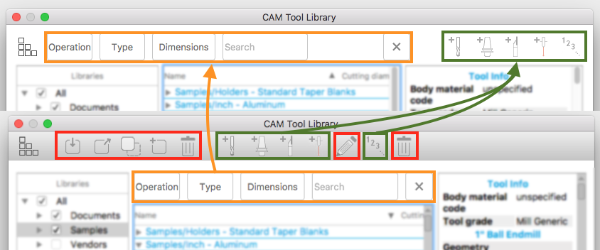
When we revamped the tool library, the most common response from users was positive. I say most common, because some of us, including myself, found the menu to be a tad bit overwhelming. There seemed to be buttons on top of buttons without clear indication of what they did, or what portion of the library they were related to. It was like jumping onto someone else’s computer to find a cluttered menu like this:

In this update we’ve made an effort to clear up the Tool Library interface by removing unnecessary items, and combining others. We consolidate the search & command controls into single toolbar, and moved the following commands to context menus: trash edit, import tool library, export tool library, and duplicate tool library. Check out the changes below. The new menu is on top, and anything in red boxes was moved to context menus:
Coming From HSMWorks?
We have some good news for those of you moving to Fusion 360 from HSMWorks. Some of those options you knew and loved have been brought over to the Fusion 360 CAM workspace. This includes the option to disable/enable ‘generation on changes’, and you can also have it ‘ask before generating valid’. Great to see more of these capabilities coming to Fusion 360!
Fusion 360 in the Browser
For everyone who has been itching to know more about when Fusion 360 is coming to the browser, we thought to take this opportunity and say…
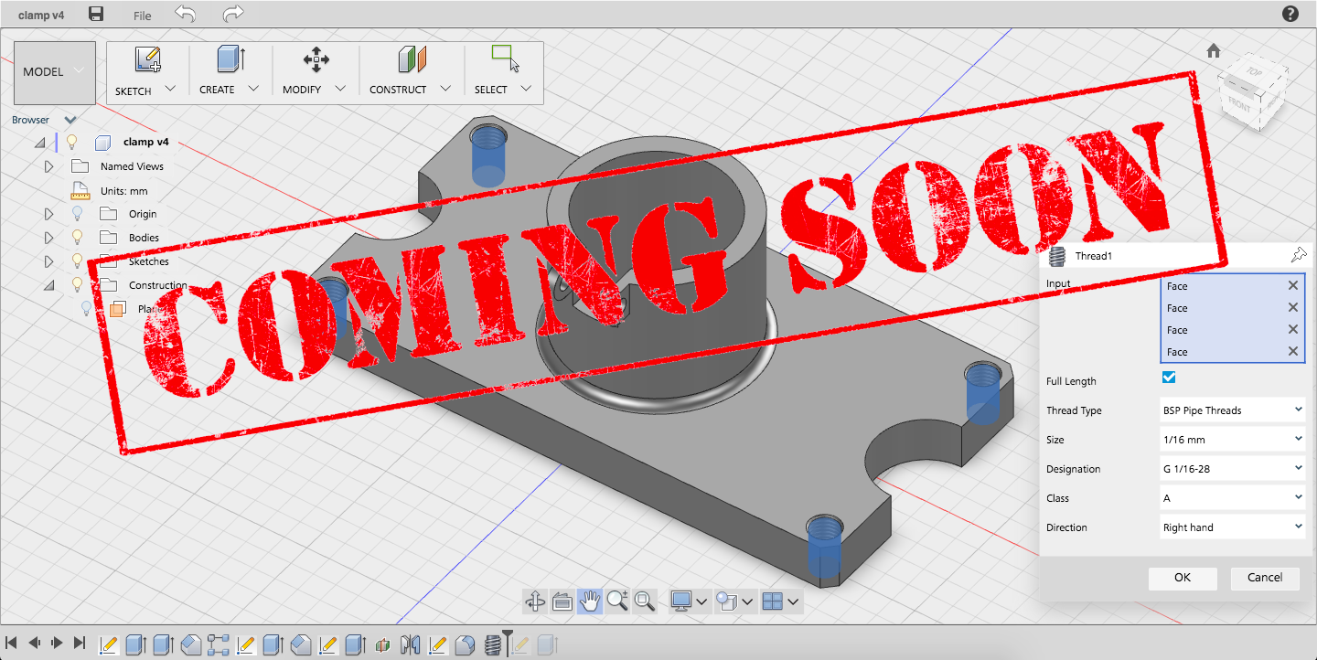
Yeah, we are not quite there, but thought it worthwhile keeping you posted. Currently it is in limited Preview, but in a few weeks we intend to take the wraps off and let everyone have a go. It will still be in Preview, but available to all Fusion 360 subscribers whenever you want to use it. And that is the real focus – being able to access your Fusion 360 data whenever – and wherever – you might be. The gif below shows the current experience – Time to get excited!
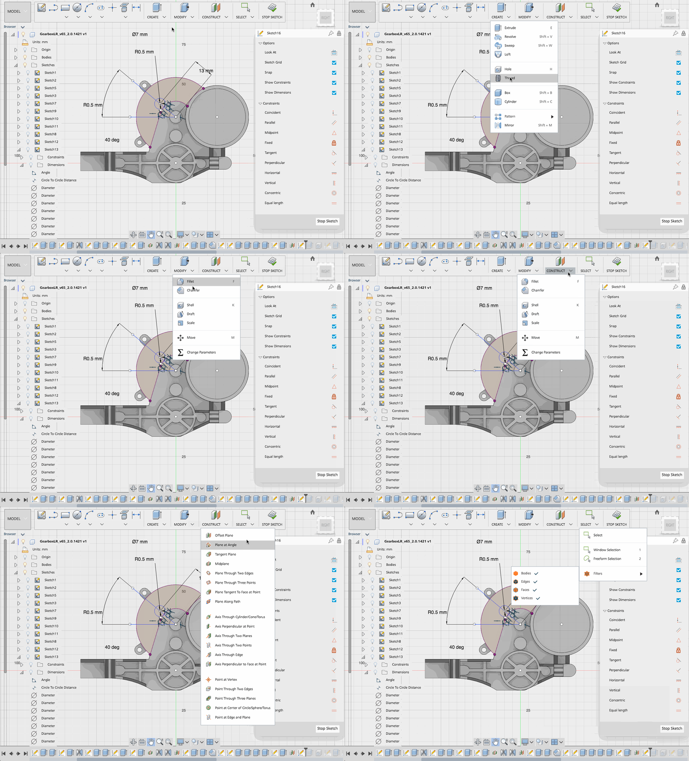
Check back in on the Preview Forum mid July, for the latest news on Fusion 360 in the Browser!
Thanks for reading. As always, let us know what you think!
~Aaron and the Fusion 360 team